Perhaps you have tried one or several WordPress themes. Maybe you found one you like but have been frustrated by its limited customization. Quickly you found you could customize colors, the background, the header, and a few more things but that’s about it. Now you are ready to either hire a web designer or design your own theme. Here I am going to show you how to build your own Genesis child theme using the Genesis Framework.

Of course, you could design your own WordPress theme from scratch just as developers do. As a beginner this is not a good idea. You will have to spend a lot of time learning how to do this. A much easier way for a beginner is to get a WordPress framework. Genesis and use it as a parent theme for your child theme.
Think of a WordPress framework as the engine and transmission of your car that provides the power to move it around. The child theme is the body and interior that give it function, comfort and beauty. The terms are a bit confusing to the public because many developers usually just sell WordPress themes, including a framework.
There are several good frameworks out there, but in this project I am using the Genesis Framework. First, if you don’t own it already, is get the Genesis framework from StudioPress. Its cost is just under $60 and you can get it here.
Install WordPress and Genesis
You can install WordPress anywhere you want, even in your own computer running a Windows by using XAMPP. But if you have an old laptop or computer lying around gathering dust you could install Linux on it. You could then use it as a test server as I detail in a previous article. One of the advantages of doing this is to use this Linux server without breaking anything. Also, you would not annoy your hosting provider.
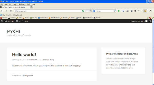
As a first step, I installed WordPress and then Genesis Framework (version 2.0.2 as of this writing) on a website elsewhere. I even pointed an old unused domain I had, http://olneyoaks.com/ to the website. I immediately installed the underConstruction plugin which you can get for free in the WordPress plugin repository. If you look at the website from the outside you would see this screen:

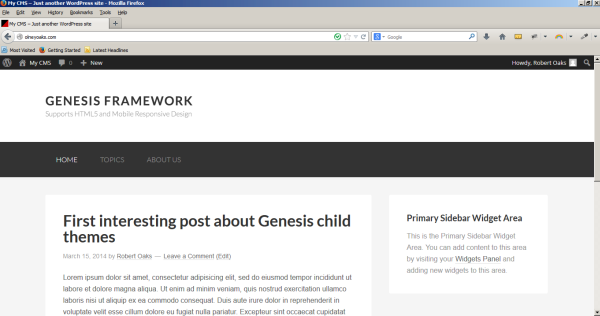
However, when you are logged in to the your website you are able to see it normally if you open the front end in another tab or window in the same browser you logged in. This prevents anybody from seeing what you’re doing while you work on it. This is what it looks like then:

Setting up the Genesis child theme
As you can see in the above figure, the Genesis Framework gives you a bare bones theme look when just installed. To create a child theme in its most basic form, all you would need to do is to make a folder containing a CSS stylesheet, the style.css file. Your new folder goes in your WordPress /wp-content/themes/ directory. That’s where all the themes you uploaded go, as well as the native themes that come with WordPress. I named my child theme Olney Oaks (you can name it whatever you want), and set up a directory for it as such:
/wp-content/themes/olney-oaks/
I then created a text file named style.css and placed it in this directory. At the top of the style.css file I added a declaration such as this:
/*
Theme Name: Olney Oaks
Description: This is a child theme created for the Genesis Framework.
Author: Roberto Fernandez Larsson
Author URI: https://discussingwp.com/
Version: 1.0

Tags: black, orange, white, one-column, two-columns, three-columns, fixed-width, custom-menu, full-width-template, sticky-post, theme-options, threaded-comments, translation-ready

Template: genesis
Template Version: 2.0.1

License: GPL-2.0+
License URI: http://www.opensource.org/licenses/gpl-license.php
*/
Presto! we have a child theme. The only two mandatory fields here are the Theme Name, which tells WordPress the name of your child theme, and the Template, which in this case tells WordPress that the parent theme is Genesis. When WordPress runs, this required style.css file completely replaces the style.css from the parent theme. Therefore, unless you put some CSS in there your theme is going to look pretty blank. Luckily, there is a shortcut here too.
Using another Genesis child theme as a starting point
The folks at StudioPress, the developers of Genesis have a free Genesis Sample Child Theme which you can download and use as your starter child theme, and it is mobile-responsive to boot. I downloaded the zip file of this starter child theme and using WinZip I did the following:
- Changed the name of the directory from genesis-sample to olney-oaks, which is what I’m naming my theme (required but use whatever name you want).
- Opened the style.css file and changed the header declarations as described above (required).
- Opened the functions.php file and changed the child theme definitions to (required):
<!--?php
//* Start the engine
include_once( get_template_directory() . '/lib/init.php' );

//* Child theme (do not remove)
define( 'CHILD_THEME_NAME', 'Olney Oaks' );
define( 'CHILD_THEME_URL', 'https://discussingwp.com/' );
define( 'CHILD_THEME_VERSION', '1.0' );

//* Enqueue Google Fonts
add_action( 'wp_enqueue_scripts', 'genesis_sample_google_fonts' );
function genesis_sample_google_fonts() {

	wp_enqueue_style( 'google-fonts', '//fonts.googleapis.com/css?family=Lato:300,400,700', array(), CHILD_THEME_VERSION );

}

//* Add HTML5 markup structure
add_theme_support( 'html5' );

//* Add viewport meta tag for mobile browsers
add_theme_support( 'genesis-responsive-viewport' );

//* Add support for custom background
add_theme_support( 'custom-background' );

//* Add support for 3-column footer widgets
add_theme_support( 'genesis-footer-widgets', 3 );
- Changed the favicon.ico in the images folder to a custom-made favicon (not required). You can upload a favicon later by just putting it in the /wp-content/themes/olney-oaks/images/ directory.
- Changed the screenshot.png image file in the olney-oaks directory to a custom made image (not required). This is the image you see in your list of themes when you go to Appearance ➙ Themes in WordPress.
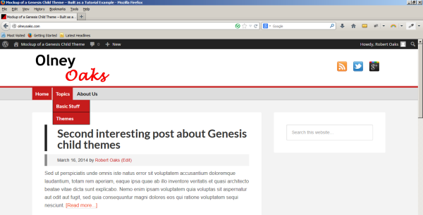
I then uploaded the Olney Oaks child theme and activated it. Remember you need to have the Genesis Framework uploaded in your list of themes, otherwise the child theme will not work. This is what the website looked like:

You can see in this image that I have already added a menu, which I will modify later, as well as a couple of bogus posts to make it easier to work with the website.
Generally, I tried to modify my child theme to look like this blog, Discussing WordPress. I didn’t use this method to design Discussing WordPress, but in doing so now with this child theme should give you a good idea how to modify Genesis to your make your own child theme.
This child theme already has support for a custom background, so the first thing I am going to do is change the background to white by going to Appearance ➙ Customize ➙ Colors, and changing the color to #ffffff.
Configuring the header
This child theme does not have the ability to customize the header easily, so to do that I will have to modify the CSS code. I wanted to add a new logo picture which I had made. This tutorial will not show you how to make your own logo picture, so you will have to figure that out yourself or wait until I write a tutorial about it.
I made a logo image for this project sized 339px X 87px and named it Olney-Oaks-Logo.png. As you can see in the above figure, this child theme already has a logo picture in place that reads “GENESIS FRAMEWORK” which I need to replace with my own picture. I used FTP to upload my picture to the images subdirectory:
/wp-content/themes/olney-oaks/images/
Now go to Genesis Theme Settings and under Header change the use for site title/logo to “Image logo” and then save the settings.
You can find instructions on how to configure a logo in this page (thanks Carrie Dils). Then I changed this code in the style.css file:
.header-image .site-title > a {
	background: url(images/logo.png) no-repeat left;
	float: left;
	min-height: 60px;
	width: 100%;
}
To this one (remember I had already uploaded the picture):
.header-image .site-title > a {
	background: url(images/Olney-Oaks-Logo.png) no-repeat left;
	float: left;
	min-height: 87px;
	width: 100%;
}
When I refreshed the homepage of the website the logo picture changed instantly to my own Olney Oaks logo picture. The height of the header needed to be adjusted to the height of my picture, so I modified the CSS class right below that code (.header-image .site-title a) to a declaration of min-height: 87px.
Like everything else, it’s up to you, but I wanted the header to be smaller so I reduced the minimum height to 100px and I reduced the top and bottom padding to zero, so I changed the CSS code for the site-header in the style.css to this code:
.site-header {
    background-color: #fff
    min-height: 100px;
}

.site-header .wrap {
    padding: 0px 0;
}
Configuring the site navigation (menu)
In the Olney Oaks live example (not available anymore), you will see that I created a menu similar to the one in DiscussingWP.com and placed it below the header. Next, I modified the CSS of the menu to make it look somewhat similar to the menu in DiscussingWP.com.
First, I changed the font size of the menu to make it larger by changing this code to 20px:
.genesis-nav-menu {
	clear: both;
	font-size: 20px;
	line-height: 1;
	width: 100%;
}
Second, I changed the menu color to code #1870c0, which is the blue color of my theme:
.nav-primary {
	background-color: #1870c0;
}
Third, the height of the menu items was too large for my taste so I reduced it by changing the top and bottom padding (the first value in a two-value shorthand) to 15px in this part of the CSS code:
.genesis-nav-menu a {
	color: #333;
	display: block;
	padding: 15px 24px;
}
Fourth, I changed the submenu color to our blue color, the font size to 20px, and the width to 250px (otherwise long menu items will wrap) in this part of the CSS code:
.genesis-nav-menu .sub-menu a {
	background-color: #1870c0;
	border: 1px solid #1870c0;
	border-top: none;
	font-size: 20px;
	padding: 20px;
	position: relative;
	width: 250px;
}
Fifth, I wanted the submenu text to be white as it is in the menu, by changing this code:
.nav-primary .genesis-nav-menu .sub-menu a {
	color: #fff;
}
Last, I wanted the current menu item, the hovered menu item and the submenu hovered menu item to be a darker shade of blue, by changing this code:
.nav-primary .genesis-nav-menu a:hover,
.nav-primary .genesis-nav-menu .current-menu-item > a,
.nav-primary .genesis-nav-menu .sub-menu .current-menu-item > a:hover {
	color: #0404B4;
}
You can study the changes introduced in the CSS and make your own changes yourself to customize the menu. Use Chrome’s built-in code inspector for this purpose. To do so, right-click on an item you want to inspect, click on “Inspect element” and it will take you there. Remember to always make a copy of style.css so you can go back to it if you make mistakes and it gets really screwed up. Of course, you can always go to the child theme you downloaded and get the original style.css file from there.
Configure all the hyperlinks
I wanted all the hyperlinks of the site to have the same blue color (#1870c0) which is one of the colors of my theme. In the Typographical Elements of the style.css file, I changed it to this:
a {
	color: #1870c0;
	text-decoration: none;
}
Modify entry title and entry meta
To add a black solid bar to the left of the entry title (the title of a post), I added this code at the bottom of the style.css file:
/* Code for Adding a Black Solid Line to the Left of the Entry Title
-------------------------------------------------------------------- */

h1.entry-title,
h2.entry-title {
	border-left: 8px solid #222;
	display: block;
	margin: 0 0 0px 0px;
	padding: 10px 0 4px 33px;
}
Next, I wanted to add a grey solid bar to the left of the entry meta (the date and author below the title of a post) as well as putting a background to it by changing this code in the style.css:
.entry-header .entry-meta {
	margin-top: 10px;
	margin-bottom: 10px;
	padding: 8px 25px 8px 33px;
	background-color:#f4f4f4;
	border-left: 8px solid #888888;
}
Modify the fonts
To modify the fonts and sizes that came with the child theme, I changed the following code in the style.css file:
body {
	background-color: #f5f5f5;
	color: #111;
	font-family: Georgia, "Times New Roman", Times, serif;
	font-size: 16px;
	font-size: 1.6rem;
	font-weight: 300;
	line-height: 27px;
	margin: 0;
}
and also:
h1,
h2,
h3,
h4,
h5,
h6 {
	color: #333;
	font-family: Georgia, "Times New Roman", Times, serif;
	font-weight: 700;
	line-height: 1.2;
	margin: 0 0 16px;
	margin: 0 0 1.6rem;
}
To make the margins and padding smaller I modified this code:
.entry {
	margin-bottom: 0px;
	padding: 0px 60px;
}
Modify footer
To modify the footer, I first proceeded to add this code to the bottom of the functions.php file. Go to Appearance –> Editor and then click on the functions.php link to open the file in the editor:
//* Customize the footer credits
add_filter( 'genesis_footer_creds_text', 'sp_footer_creds_text' );
function sp_footer_creds_text() {
	echo '<div class="creds"&mt;<p<';
	echo 'Copyright © ';
	echo date('Y');
	echo ' · by <a href="https://discussingwp.com/about-discussing-wordpress/"<Roberto Fernandez Larsson</a< · Powered by <a href="http://wordpress.org/"<WordPress</a< · Built on the <a href="http://www.studiopress.com/themes/genesis" title="Genesis Framework"<Genesis Framework</a<<br<This website is a demonstration for a tutorial on building a Genesis child theme<br<You can <a href="https://discussingwp.com/wordpress-themes/build-a-genesis-child-theme-for-wordpress-part-1/"<access the tutorial here</a<<br<';
	echo '</p<</div<';
}
After you update the file and you refresh the homepage you will notice that the footer has changed. Of course, you can modify the HTML in that code to your own needs. I then modified the following CSS code to change the site footer to my own design:
.site-footer {
	background-color: #1870c0;
	color: #fff;
	font-size: 16px;
	line-height: 1.5;
	padding: 20px 0;
	margin-top: 30px;
	text-align: center;
}

.site-footer a {
	color: #fff;
	text-decoration: underline;
}

Conclusions
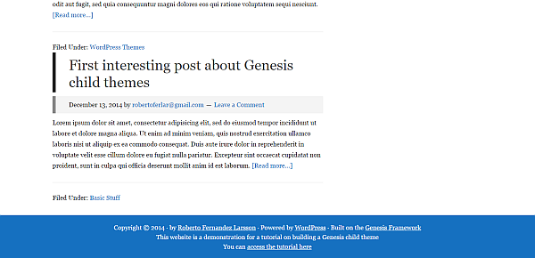
As you can see, the original child theme comes with 3 footer widget areas that I filled with text. I did not modify theses in any way. If you don’t put anything in them they will not show at all. You could also use one, two or three of these widget areas and you can radically change the way they look in the “Footer Widgets” section of the style sheet.
I hope you enjoyed reading this tutorial on how to build your own Genesis child theme. There are many, many a customization one could. I wanted to give you a good starter on the subject. Obviously, if you deepen your knowledge in CSS (and it’s easy!) you can go a lot farther. In Part 2, I will teach you how to set up a static homepage. More widget areas, a homepage slider and more.
Feel free to leave a comment if you find any errors within the guide. Also if you just want to share what you think about it.
Note: This article was updated 12/16/2014 for using the Genesis child theme, version 2.1.2.


Awesome post bro 🙂
Thanks, Jaidayal, I’m glad it helped!
very very helpfull post sir thanks for writting this post